
Hello friends and thank you for once again choosing to read the devlog for Stealthy Dicey. The Metal Gear inspired game made in the limitations of the gameboy color that me and a couple of friends at Atelier Cassette, the studio I’m a part of are making. I aim to update everyone on my progress every week and use this as a way to combat both my imposter syndrome, that says I don’t do anything game dev, and to have something neat to look back on in a year or two. Indeed I have already used this dev logs as a reminder that I am making cool stuff I am proud of.
Last week I had done some character portraits and visuals for what would end up being the codec. Those simple two or three frame animations were important if what we wanted was that loving, cute homage but we had not yet gotten the background for the codec made. As the character artist who dabbled in UI design that task fell to me. How hard could it be? I had thoughts, and I had ideas but nothing concrete yet.
In thinking of radio in Gameboy color my first thought went, naturally to Pokemon Gold and Silver which featured a full fledged radio. With the 30th anniversary of Pokemon last week Pokemon had been on my mind anyway so i quickly went down memory lane and booted up my old copy of Pokemon Gold. Of course, finding that the battery had run dry, as it always does after a couple years I decided to instead open Youtube, to get the visual design.
While I was already on Youtube I also opened the Codec from Metal Gear Solid on the original Playstation. I had a pretty good idea of what I THOUGHT it looked like but I wanted to be sure. Indeed my memories were mostly correct, two squares, a frequency/connection signal, text. Mixing it up with the Pokemon Radio design seemed pretty simple in my mind.
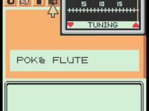
The radio channel on the Pokegear. A radio with tiny little “!” bars where you can move a bar left or right to adjust frequencies so you can listen to radio.
My thinking was simple. A rectangle with frequencies (just little bars, really) and another, bigger white rectangle bar like that moves left and right to select a frequency. Pretty soon I had a design that mixed both the portrait squares of Metal Gear with the radio like design of the Pokemon Radio. I decided to decorate the frame with signal bars, permanently stuck at two out of three bars. After all they might be placing you in a prison base you need to escape from but they’re not uncharitable. Of course they share the wifi password. Pretty soon I had a good base design.
Since I’m not the one programming the game but rather the one making some of the art I decided that the easiest way to see if my idea worked was to “fake” a game screen by using my favorite video editor software to mix different images into sort of the intended effect. From last week I had the portraits for the codec.
I created a separate sprite, same size as the entire codec background with a simple white bar in the middle, to act as my radio’s tuner. While I could have simply made a 16 by 4 sprite or something similar to serve as the tuner having them be the same size made my job of layering it over the other one simpler. Then I keyframed it going right. When it stopped I added the portraits and some text. This wasn’t done in engine but it was a passable enough attempt at how it could look like.
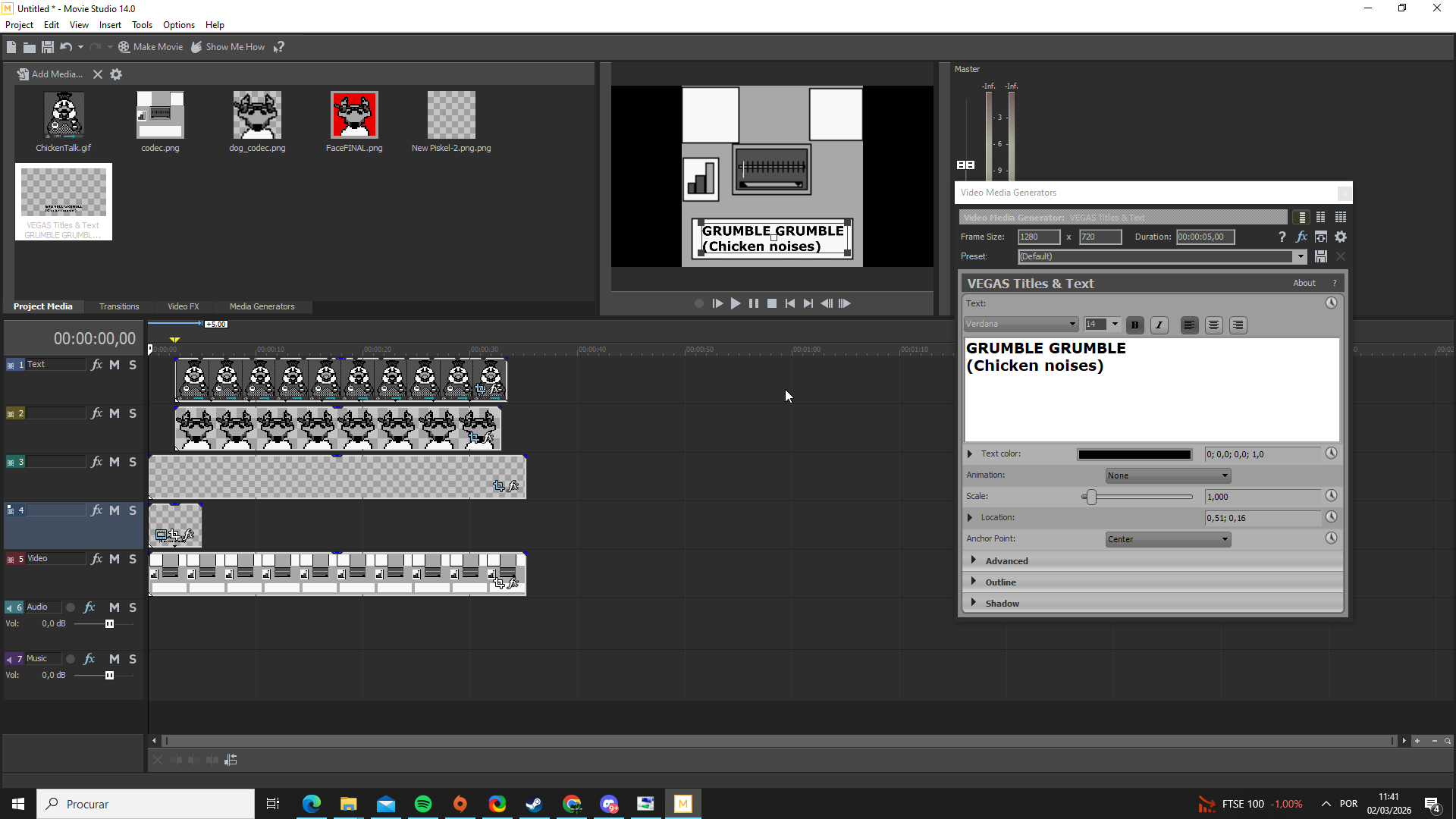
Screenshot of Sony Vegas where 5 video layers, each with a separate image are viisble. A text element is being added at the moment.
It took a few adjustements to cut and get everything looking right. After all the characters should not appear until the tuner reached the right point. But a few adjustements to video layers, And where they appeared or cut and I had something I was proud to show the rest of the team as the suggested codec. Although some of the work lacked polish, as expected for a 5-10 minute editing job, with some of the gif still showing the wrong UI as I grabbed the example gifs rather than manually animating the spritesheet, and sizes and placement were not perfectly centered the visual example was there. Enough to show the rest of the team for an opinion.
I also sneaked in the Cassette like look because, after all our team is named Atelier Cassette, so it just felt right, as a little Easter egg.
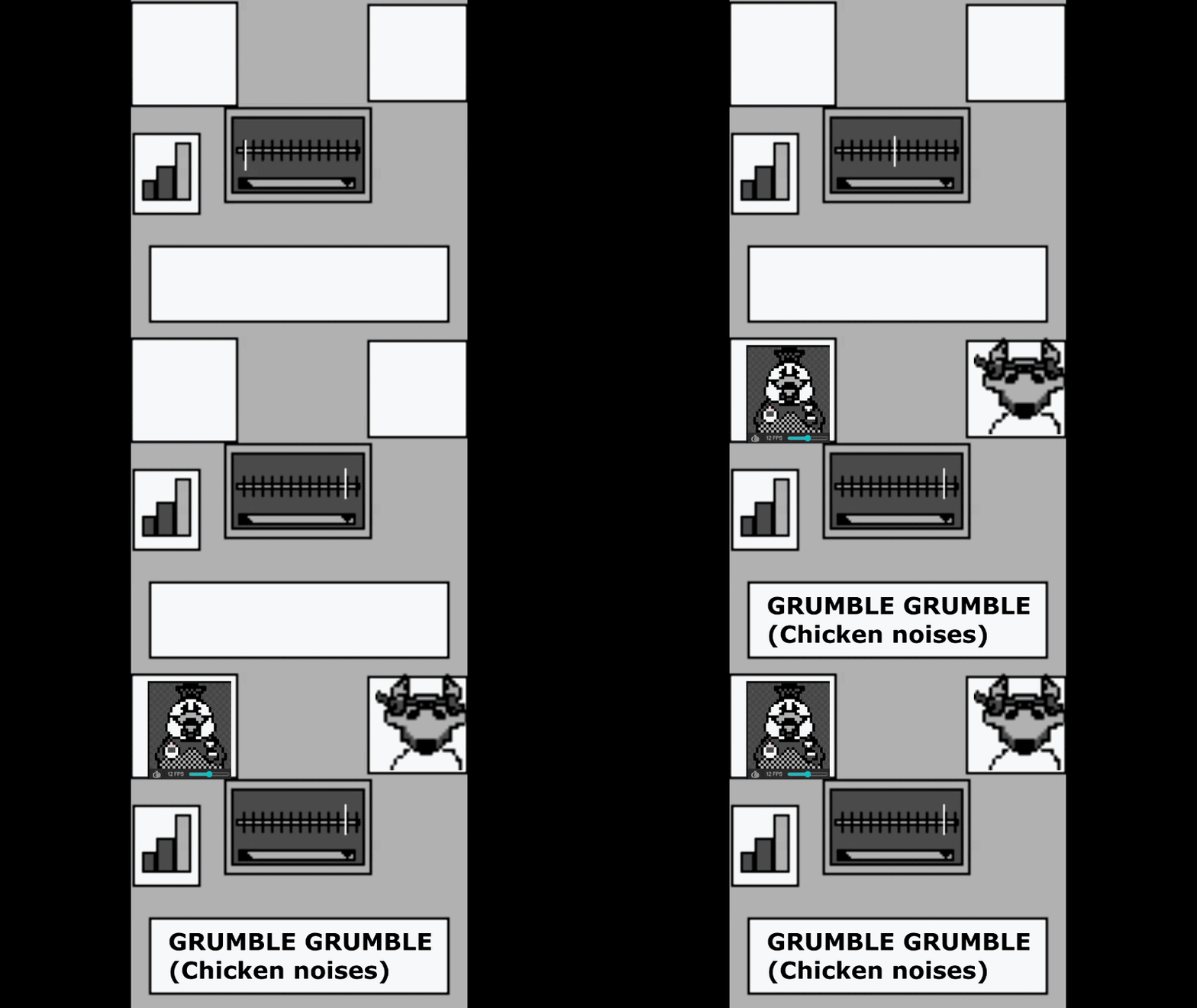
The codec simulated on a video program. A white line on the radio moves right, then the characters appear and text shows up at the text box reading “grumble grumble (chicken noises) as the characters flap their mouths in the portraits above.
With a mockup done the next thing to do was to fix the width and height of the squares where the portraits lay so they were the same size. With that done and a pretty competent Codec UI done I turned towards the next goal I had.
PALM TREE PANIC
While I had been busy doing the Codec and playing around with different character and their designs our environmental artist, Dolores had been busy creating a tileset so as to hopefully have it ready to start with level design by the end of the week. Because we deeply love cliches and this is a kind of parody and deconstruction of the genre the first “level” was to be set in a jungle area. Or some kind of tropical island that playfully mocks the idea of extraction where cigar muching heroes with more pectorals than brains head to some humid island, storm the beach and save the day and the president’s daughter. I was reminded of the game BroForce and their levels.
Unfortunately while Dolores has been slaying it in every single other area of the game (seriously their grass is top notch) palm trees had been proving difficult for her. She had been trying for days with no luck. It was not a matter of skill, I must stress. Her other work is great and does leave me with my mouth open as I consider how great it looks. No, palm trees were simply a thing that she couldn’t draw and after a couple days she asked for my help.
It was a challenging request. When thinking about palm trees, naturally I think of the drooping leaves and very tall structure. My first mistake was to try and exagerate the leaves. My second? Simply not using a tall enough canvas.
I looked at examples from other games playable on Gameboy Color. Survival Kids, in particular being set on a desert island was of great inspiration to me, but Adventure Island on Gameboy also provided some great inspiration. Feeling ready to try and do it I locked in. Using tricks for shading that felt way more advanced than I usually would do (but really I was mimicking what the great artists at Konami had already done) I ended up, after about 10 to 15 minutes with a palm tree I was really very much proud of. It fit with the mood of the game. It fit the perspective. And if you’ll allow me to be silly, I would go so far as to say it was a good looking Palm Tree. It was a palm tree I was fairly proud to call my own.
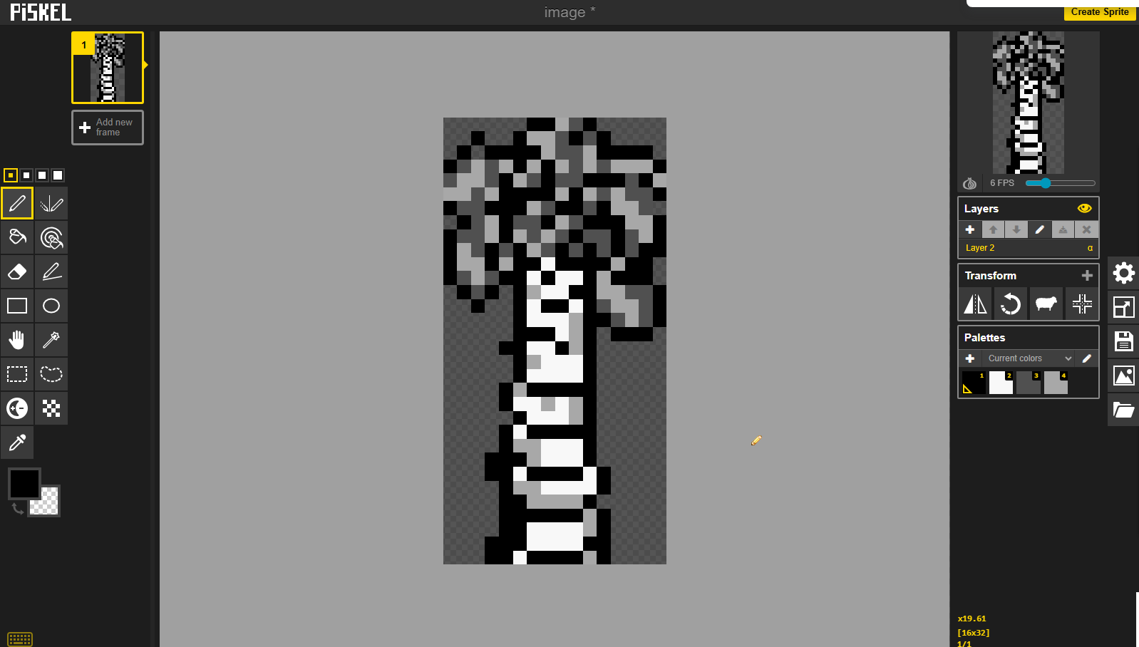
Pixel art Palm tree drawn in 4 colors and 16 x 32. It has fairly detailed shading.
The only doubt that remained was whether or not it would fit in with the characters and the rest of the world. Using the grass, mud and rock tiles already made by Dolores (who, again is doing great work) and grabbing some of the characters I already designed I looked at a 160 x 144, the resolution of the Gameboy, canvas and created a screen of the game…
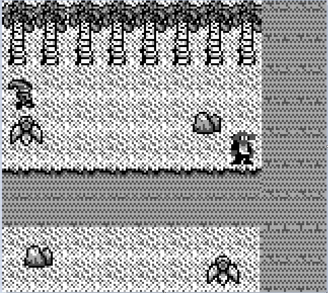
A potential screen for Stealthy Dicey DX. Palm trees, grass and a mud path delineate a way for the player, Rocks and flowers decorate the scenery and the player sneaks through the left of the screen. A single enemy near the mud path looks in the general direction of the player, not yet having detected him.
Although picking darker gray for the enemy character’s skin, prior to adding shaders to add colors does look a bit unfortunate. The general idea is there and a single screen of the world, to serve as inspiration was born. Though a few errors layering stuff meant one of the palm trees had some of its foliage cut it allowed some direction for the team and idea of how to proceed.
And while Dolores works on finishing the environmental art and tiles so that we can start level design, I will look at my palm tree as a worthy contribution to the world.
So this week on Stealthy Dicey I:
- Created a video preview of what the codec will end up looking like
- Contributed to the world tilemap
- Created an early screen of what the game will probably end up looking like
- Discovered why using dark grey for enemies is a bad idea-
All the while I had another hyperfocus session which resulted in a new game, joined a game jam and updated my Pokemon fanfic. But those are things for another day. For now however Stealthy Dicey really seems to be shaping up!