
Hello and welcome back friends to another Stealthy Dicey developer blog. Stealthy Dicey is the Metal Gear like parody game me and a couple of friends at Atelier Cassette are developing together to a state where it can, hopefully, get a commercial release. When last I wrote I had developed a small prototype of a minigame in order to combat the fact that the game had seemingly stopped being updated. With our programmer gone, our producer having a laryngitis and our environmental artist recovering from carpal tunnel, as well as our programmer leaving the project for personal reasons the project still hasn’t yet in full restarted or gained back the steam it once had but I remain working actively on it.
I had been thinking about our main character, the wolf like I had designed earlier. Though the character design concept had solified and we now had a specific look and character, and had even proceeded to create sprites based on it in the 4 colors of the Gameboy Color limitations that did not mean that I did not wish to experiment. Not with the concept itself, which was rather solid (and if we go back to devlog number 2 you can look at the iterations), but rather with the art style. When first we had started I had used the rough concept of “Spyro colors, Sly proportions” and that remained something I was rather proud of. However I had found myself with nothing to do, recovering from dental surgery and bored out of my mind so I thought…why not create some kind of cover art concept?
Now of course when we don’t have even a playable prototype then creating a finalised cover art is a ridiculous notion. Though we have a game design doc and ideas on what we wan to do and even game length (a disagreement within the team) and number of areas we’re not starting from scratch but there are some elements that can and will influence the design. Why create something now? The truth is that it came mostly out of boredom.
Good cover art grabs your attention immediately. If you’re looking through Steam thumbnails and see something you like that means you click on the Steam page and might even watch the gameplay video and buy the game. Indeed I am guilty of buying games based on a quick first impression from the cover art itself. I’ve literally hung iconic cover art from games I enjoyed and want to show I’m a fan of in my walls, back when I had the stability and space to do so. I have done marketing text translation and it is a completely different skill from regular game translation. Selling your game to people – through a single image or text is hard and a challenge I was prepared to tackle. As with everything I thought the best way to do it was to look at examples of stuff I had enjoyed and see what I could gleam and learn from it.
I thought the best place to start would be with James Bond, 007, and posing. The look of the character holding a gun pointing up was something that I fondly remembered from my childood. The three James Bond games on PSX, the Playstation One were some of the first games featuring guns and shooting I played and they looked iconic to me. The character’s head looking directly at the player or sideways. Their gun held as if a threat could pop up at any moment. Ready to shoot, fire and explosions behind them. It was a look I love and a look I associate with the James Bond series. Tomorrow Never Dies and The World is not Enough are two very different games in look and feel. They’re very different in many other ways as well and I remember getting stuck in the first level of The World is Not Enough and replaying the section where you use a gadget pen to sneak around dozens of times. But those covers stayed in my mind.
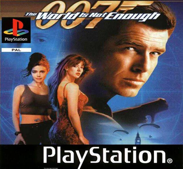
Pal PS1 cover for 007 the World is not Enough. James Bond looks at the player holding a weapon as two girls in crop tops and a revealing dress face the opposite way to him, looking at the camera.
Just a vague blue background, the protagonist standing and looking at the Player. That was an initial idea and something I thought about doing. In fact the Tomorrow Never Dies cover is even more bombastic and features a jet, as well as a car running from it. It was the kind of energy that would make me look at the game if it were released and I saw it.
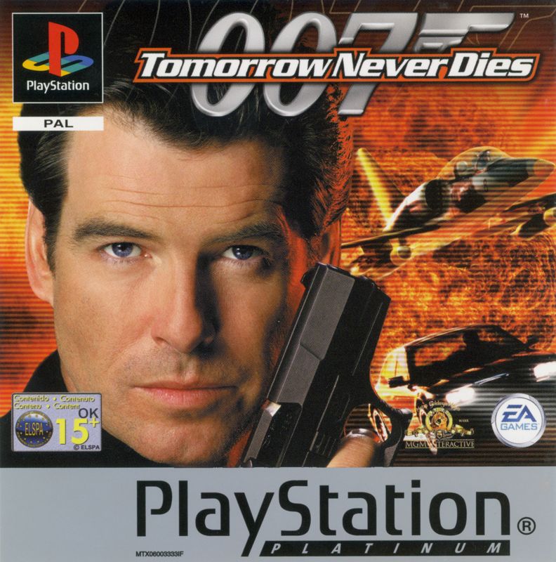
Playstation Platinum PAL cover of Tomorrow never Dies. James Bond looks directly at the player, behind him explosions and cars performing stunts.
Another thing I looked at were covers for cartridges on the Gameboy. Given that Stealthy Dicey is being designed to emulate the limitations of the Gameboy Color this only made sense to me. What was the design placed on the cartridge you popped on the Gameboy itself? A lot of games based on movies used pictures of the actors, something I saw with the covers of the Playstation games earlier mentioned (that are basically just the movie posters). I wanted to do something more.
The “Newgrounds” flash look is a look that sterns from the limitations of Adobe Flash. Prioritising dark thick lines, no angular angles and a sort of chibified design Flash as an animation software was famous for its use of circles and rounded edges. It is a style best perpetuated by Newgrounds, a web portal for flash games and animations and the kind of edgy humor and homopohbia of the early 2000s. In it giving kids guns and making them look “thug-ish” was a common occurence.
Nothing perhaps exemplifies this than the game Friday Night Funkin. Now before becoming a kickstarter that has produced a whole lot of nothing in the 5 or 6 years since it got funded due to overpromises, with developers unable to act professional and defending predators (and wow that took a turn) the game evoked and was very much built with the Newgrounds community and style in mind. If we look at the game’s protagonist. We can see this.
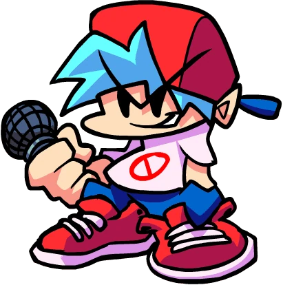
“Boyfriend” from Friday Night Funkin. They feature a squished design with overly large hands and feets and a smirk.
It was a style that, truthfully was not too far away from mine. When designing furry characters, despite how well I feel about the Sly Cooper like character design my standard is for characters best described as “Animal crossing proportions with Sonic Feet”. Huge rounded feet, big heads, not overly slender limbs. In fact we can look at this with some of the art I have posted online under the years under different handles.
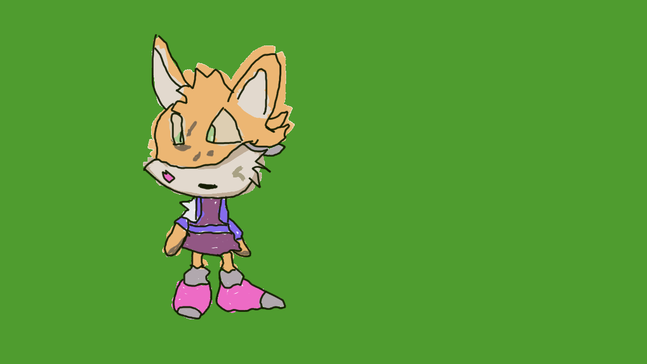
Drawing of a fox like character. Overly big head, and stumpy limbs and feet that relative to body size are bigger than normal. Drawn sometime in 2024. Drawing isn’t properly colored yet and colors bleed out but a clear art style can be seen.
So, I thought, why not use the design I am most familiar with, and try to apply it to the cover art? And since the game is in such an early design phase that there is not yet anything else to put it in the cover why not just make it a vague blue background? The character facing the player holding a weapon in a cool pose. Maybe holding the gun sideways, like they used to do in movies? With that goal in mind I got to work…
It didn’t take long at all. These were the proportions I was far more comfortable with anyway and making the character hold some of that sharpness and edge was not complicated. Since our game is not set to feature any guns however it felt that maybe the character rejecting the weapon would be a better look. For that reason the character, tentatively titled Wolf holds the gun with one hand, pushing it away while with the other they make it very clear they are not holding it. Looking directly at the player, looking somewhat displeased at making to hold the weapon as if saying “seriously” it looked both cute and iconic. Having drawn the character however I felt that something was missing and I decided that maybe I could “make” the cartridge where such art would faeture. Drawing it in a Gameboy Black cartridge (compatible with both original Gameboy and Gameboy Color) pretty soon I had something I felt happy with.
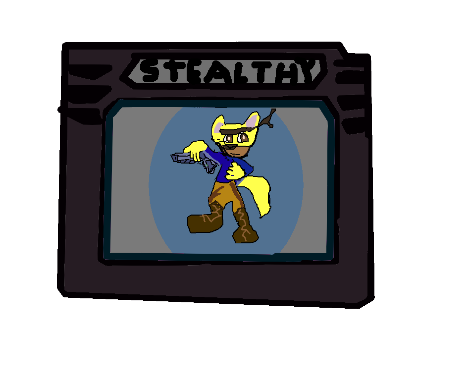
Potential cover art for Stealthy Dicey. It’s a black gameboy catridge with the GAMEBOY engraving replaced with STEALTHY. The picture in it is the main character of Stealthy Dicey DX, but drawn in a far cuter and chibified look.
It is probably not the final art, or even the concept for it. It is mainly an exercise in what to draw and a way to fight boredom. Still when I surprise showed it to members of Atelier Cassette they enjoyed the look. While the game is still not being actively working on by everyone, Dolores’ carpal tunnel just now healing and our producer taking pills for her disease well into next week, it is a way to maintain consistency and keep the team excited and pumped for what’s to come. I hope that we can return to the project relatively soon and resume working on it. We had originally given ourselves a deadline of 6 months, or about 22 weeks and we are now in week 13 or 14 and there is very little to show for it. Still both me and the team are fairly excited about it and ready to work on it when our health allows.
So this week on Stealthy Dicey I:
- Made some cover art
- Watched a ton of old flash shorts and cringed at the punching down
- Debated with myself if explosions really ARE needed in cover art
- Got sidetracked watching someone complete the PSX version of The World is Not Enough.