
Hello and once again welcome to the developer logs for Stealthy Dicey. This is the space where, weekly I go through what I did on the sotft Metal Gear parody me and my friends at Atelier Cassette are developing, Stealthy Dicey. Though I am in charge of the character animation and art the game remains a collaborative process with the goal of making something we can all be proud of at the end of the day AND something we can ship. After all, finishing things is a skill all on its own and used like I am to my jam games working on something bigger is a good skill to practice.
This week on Stealthy Dicey I decided to take a look at some UI elements. Now when one thinks Metal Gear Solid one thinks of the codec and conversations between David and the Coronel. Now that I’ve made members of my system and some of you reading this upset at the fact I refer to Snake as David, ebven if technically correct the question of the coded still remained. In the prototype we had sidestepped the question of UI entirely by simply…not having it. It didn’t exist and when we cut to the coded conversation we simply showed the walkie talkie/ comm devide used to talk. This has worked on the 10 day jam and guaranteed we could (barely) finish but did not properly fit with the parody and loving homage aspects I so wanted to make.
My first inspiration was actually Anodyne 2: Return to Dust where, for plot related reasons I won’t spoil there is a seed that is placed on the UI on certain parts of the game. That UI plays double duty. Given the game mimics the resolution of the Gameboy and the game came out on modern consoles it fills the widescreen screen. It is also a story element. With the inspiration in mind I looked at my 32 by 32 canvas and decided to start by vaguely doing a circle.
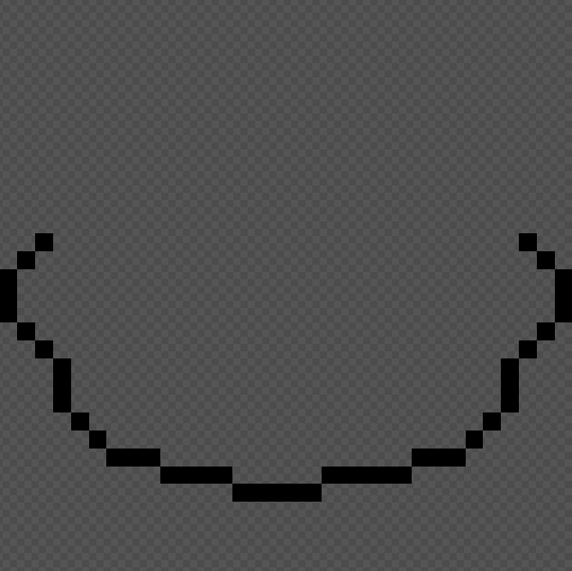
Vaguely circle looking half of a face. Done by doing three pixels down, two diagonal, two more pixels down, diagonal etc until it meets at the bottom.
The circle sensibility fit with our “cute rather than threatening” motif. Having a character that looks cute in the UI or cutscenes despite the environment not looking particularly nice to exist with was something I was trying to achieve. The problem was..There already is a bright yellow character with a roundish face and black dot eyes. It didn’t take long before someone made the inevitable connection to the bear now in the public domain. Winnie the Pooh.
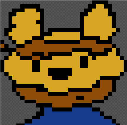
The main protagonist of stealthy Dicey with a round face. Despite the pointy ears it still looks remarkably like a baer not a dog.
I had even animated the character. I had given him bigger ears and a change in expression but none of that helped. It still looked far too much like the character popularised by Disney. The rest of the taem agreed. They urged me to go for a “less blob, more pointy” look and face.
Deciding that if pointy was the pointy I was going full on pointy I started work yet again…
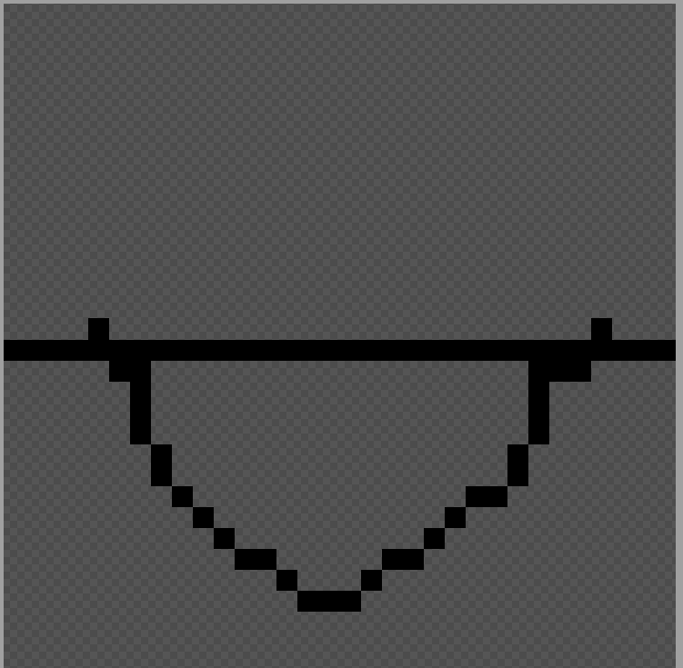
a face being designed, half of its outline is visible. It looks fairly pointed and almost triangular.
Using the idea that it needed to be more angular and sharp as features and ideas of what to do I started pushing towards the pointier design. It didn’t take me as long as I worried to keep there. Despite looking far more vulpine than canine the main character looked now far less cute and far more fierce. Ready for anything I thought. This was the final result.
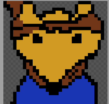
The main character with the “fox face” now colored with the colors of the character. It looks far too much like a fox for it to look like a wolf.
The team all agreed. It looked far too much like a fox. In fact someone even compared it to the thieving fox from Dora with the bandana and all. Though I quite looked both variations I had done already, ranging from the cutest possible to ready for business I decided to try once more. Knowing it that our main character is supposed to be a wolf, even if with big golden retriever energy I locked in. I looked at how wolves are portrayed in video games. I especially looked at Star Fox. I was ready to do this!
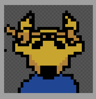
The main character of Stealthy Dicey faces the player. Their face has been redesigned so their snout resembles a wolf, more than a fox or bear. The ears now perk up.
And though it made them appear sad, which is an unintended effect once one removes the color, I proceeded to then change the fully colored version to the grayscales we use as a basis for the game before colors are added. We now finally had our Codec wolf.
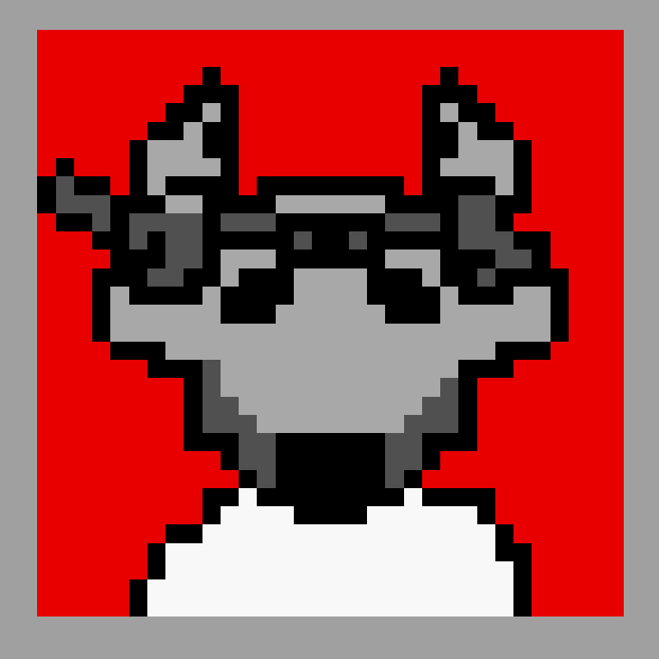
The wolf main character but their colors have been stripped out so it now they sit in grayscale ready for the shader coloring.
Though part of me still mourned the completely animated and very cute looking bear looking one. But because I couldn’t just let him sit in my hard drive waiting for bit rot I decided to post him here, as a memorial of sorts.
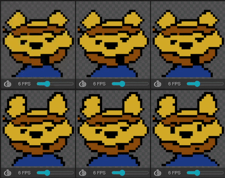
Looping 3 frame animation of the main character, still looking like a bear talking. Their eyes and expression change and their mouth opens and closes, as indicated by the pixels that make up his mouth increasing to a square of different sizes before turning into a line.
A rooster problem
Having previously decided that the character who talks to our main character through the codec is a rooster it was time to design the character. Initially I pictured them as a bit of a cliche, moustache like a sea lion, looking sharp and angry, aged. The kind that had seen a thousand and one men go and perish under his watch. Those all died when I heard that I was supposed to be drawing a rooster however.
One of my headmates, who is a bird and oh so very autistic towards them (she often goes BIRB! and can spend hours birdwatching or watching random bird videos on Youtube) had given me an interest in drawing birds. It was a type of creature that I had a lot of experience drawing and greatly enjoyed. Deceptively simple to draw but hard to master to fundamentally make them understandable in design language with as little as 32 by 32 pixels was something that I considered a challenge. A challenge I was fully ready to face.
I looked at the Looney Tunes character Longhorn but it didn’t particularly fit with the style of character I awnted to make. Though yeah, no doubt a good design I had my own design considerations and approaches to drawing birds that I figured I’d use. Without further thought i started.
It was important to me tha the rooster like character appeared to be sticking his chest out, with his hands/wings behind his back. This is both a visual i associate with military, all proper and in order, and with birds, where they shove their chest at you. Roosters, in particular which I grew up around are highly territorial and will chase you if you get too close. They also never shut up, but that was a detail maybe more centered on story than animation. I added a few cute detalis. one of the medals on his vest is egg shaped (because of course). Soon eonugh, in less than 10 minutes I had the design.
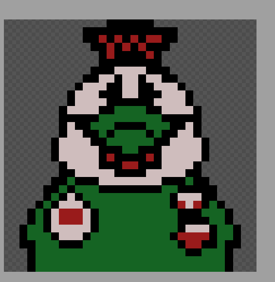
The rooster done in the limitations of the gameboy color of only colors. It appears to be preening. It uses white, green, red and black.
I had switched to a simple one/two frame animatoin style with the codec and I knew exactly how to make it appear as if the Colonel was speaking, simply coloring part of his beak green, somethi ng that took all of 30 seconds sold the illusion. It looked, in my opinion, great.
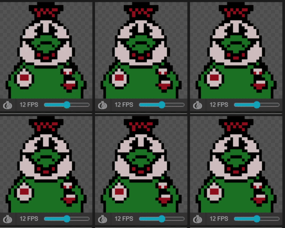
The Colonel character, a rooster talking. A simple two frame animation where he opens and closes his beak (simply by coloring a certain part of his body black)
The last thing I had to do then? Turn the character into grayscale. Something which made any outline or proportion mistakes far more likely to appear and be noticeable. This time however, and with the help of good design I thought that grayscale made the design pop out even more. I’m fairly proud of how it turned out.
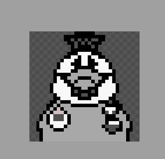
The rooster main character in 4 color grayscale. They appear to be pushing their chest forward, looking all proper and military like.
For this week’s work, I was fairly satisfied with it until I put it in a screen and saw how much that huge expanse of green bothered me. Something else also stood out ot me. The beak closing and opening by simply turning the bottom half black worked, but felt clunky, puppet like. In a ziffy I applied a dithering pattern. There. It looked good. But there was something else I could do. Rather than color the entire bottom half of the beak black I moved everything down by two pixels and redrew the edges of the beak. The neck looked a bit iffy because I had also gotten some of that so I fixed it.
It’s those small bit of polish that really count. I was now fairly proud of my work, prouder still and I decided that it looked good now. Here is the final result:
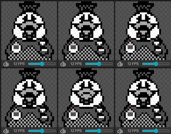
An animated gif of the chicken character talking, their break moves up and down as they talk, revealing a space in the middle, their mouth, unlike earlier iterations where their beak was colored black. A pattern has been added to their suit.
So this week on Stealthy Dicey DX I:
- Started thinking about UI
- Created the character portraits for coded
- Went from Bear to Fox to Wolf
- Made a highly condecorated official, using my knowledge of birds
- Animated a rooster, making it ready for codec
Overall one of the most productive weeks I have had. I am fairly happy with the work done. Hopefully the work continues! I will see you all next week on the next Dev Log!