
Hello friends and welcome once again to another development log for Stealthy Dicey. This is the space where I chronicle the weekly progress on Stealthy Dicey, the Gameboy Color like Metal Gear inspired stealth game me and a couple of friends at Atelier Cassette are working on. From documenting inspirations for visual design (which we did in the last development blog) to narrating miscommunication that results in wasted time and energy I tell it all it in these posts. This week ended up being a continuation of last week as, inspiration ready to be presented I met with the environmental artist (and also only other artist in the project) so that we could discuss art direction and design. As I had previously been put in charge of characters this task was important. After all what use is making cute, chibified designs if afterwards they’re put in a damp, cold, brutalist world? So the task set out for me this week was to meet up and come to an agreement.
It was a task that sounded more daunting that it sounded. The benefit of working with friends is that we tend to share a rapport and method of communicatoin that cuts through the (much needed at times) business and producer like that I employ as the QA lead at Hip Flask Games. Though I have taken sort of the role of “team mom” and do my best to always be there for my team and to provide for them and their aspirations as good of a lead as I am that does not compare to the years and months of injokes and ability to be relaxed and blunt that sterns from friendship. Put ismply if my ideas were in some way not ideal for the project I would not get the sugarcoated version of “This is good but…”. We’d cut right through that and, with the typical bluntness of our Environmental Artist I’d hear it plain and simple. “Yeah, no, this is crap”.
And although I could talk about my imposter syndrome, like I do every devlog, and how my friends telling me the art I put so much effort into risks sending me spiraling into rejection sensitive dysphoria that is not what I feel at the moment. Indeed it also isn’t how I would have felt had the meeting gone poorly. Which it didn’t.
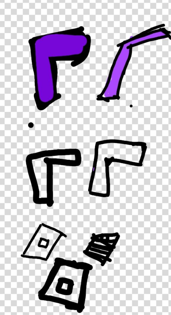
A series of sketches of walls. The walls are a bunch of L shapes with different thickness and colors applied to it. A crude attempt at a texture or 3d was applied by drawing simple lines over a square. Very simple, made on the spot to illustrate an idea.
We started by praising each other’s work and design sensibilities. Something important as we genuinely enjoy each other’s work and the effort being made. After quickly agreeing “cute not edgy” it wasn’t long before the first question was placed. If our game concept is about extraction from military bases, and the main character is captured and arrested how do we reconcile the need for austere and unwelcoming with the cute aesthetic?
It was a good question. One that I had no answer for at the time. I had been toying with the idea of suggesting rounding up edges and making designs rounder and less angled following the universal rule that “rounder equals cuter” but that question cut right through that idea. The environmental artist, who I’m just going to call by her name, Dolores because it feels so impersonal to keep saying the Environmental Artist wanted to know if it would be ok to have a more “realistic” environment compared to the cute cartoony aesthetic of the characters.
Now I put realistic between quotation marks there because no hidden base in the jungle is bright purple or deep blue. But the question, marvelously put did make me reassess my plan to round out every feature. I had even drawn something on my phone to indicate the concept, which we then quickly discarded, agreeing sharp lines and angular objects were the clear winners.
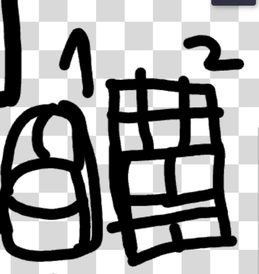
Two crudely drawn boxes with 1 and 2 over them. Number one is round and has no sharp edges or straight lines. No 90 degree angles. Number 2 is a 3D cube with plenty of 90 degree angles and turns.. Number 1 looks “cuter and less intimidating” compared to number 2 which is just…well a box like you’d find at a real base.
Which led us to the next question. The walls. When I had presented Buzz Lightyear of Star Command on Gameboy Color last week I had praised how it heavily simulated depth and 3D using curved, thick outlines and thick shapes in rooms. It did its job in presenting us with a fake 3D like Z depth but Dolores was not a fan of it. Indeed she said that she felt it would make it harder to add detailing like keypads and that it felt “weird and compressed”. She would much rather an approach like Pokémon where the awlls are straight and the delimitation is done by the outline on the floor. Cursing my lack of line tool in the cheap paint app I had on my phone (it had come pre-installed hence why I used it) I attempted to visualise it.
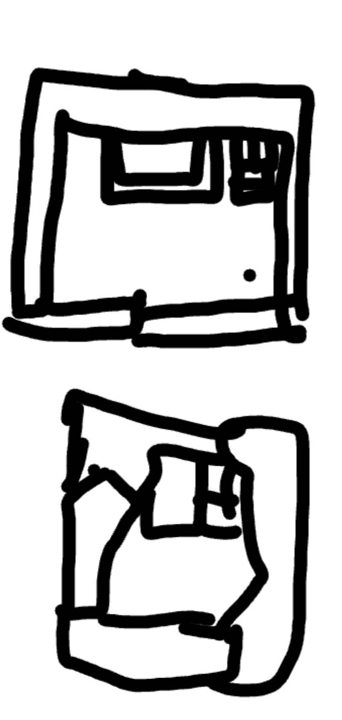
Two squares representing rooms drawn in very different ways. One has “straight lines” not overly thick while the other has walls that are formed by thick “blocks” rather than lines.
There were some misunderstandings and even poor attempts at clarifying what I meant by using the Green Square emoji on Discord to try and draw a room. An absolutely pitiful and not very enjoyable experience. By this point Dolores clarified any and all doubts by simply showcasing what she meant on a drawing where she DID have access to line tools, unlike me.
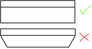
Comparison between two walls. One has straight lines all around. The other has diagonal lines to represent “straight lines” and has more of a birds eye, almost 45 degree angle view. The first one is the one we both choose to keep.
Right around the same time while making jokes that would result in new features (what about balconies? An excellent suggestion by Dolores) I decided I had had enough of the cheap paint app, promised myself I’d download something better for next time and simply opened excel to try and represent the same idea. Remembering how some people used excel to make patterns, pixel art and even games I quickly devised something.
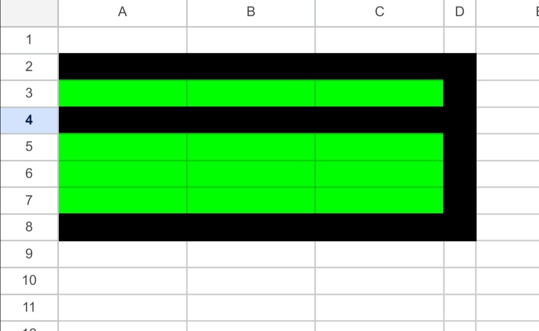
A “wall” drawn up in excel by coloring cells green and black. The walls in it are straight.
Now in agreement at the type of design we wanted and how realistic the world could be, or at least how straight lines could be the only thing left was the question Spyro or Sly. It wasn’t as simple as question as it first appeared. While both had been used as inspiration so far they had two very different strengths. One exceled in cuteness with its overly large heads and big eyes while the other was more stylised. Something that had always stood out to me was that the legs of Sly Cooper were particularly long but that had been something I had adopted into my own style whenever I drew any furry characters. In the end the decision had already been made by us. When designing the main character I had used Sly like propotions. In fact when we compared them it was eeerily similar.
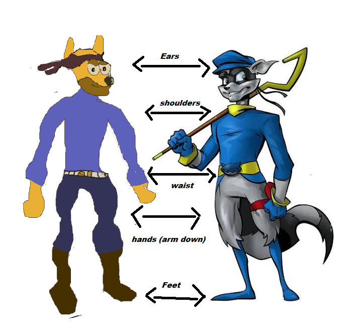
The main character of Stealthy Dicey next to a render of Sly in Sly 2. Arrows compare their proportions at ear, shoulder, waist, hand and feet . The proportions are about 95 percent the same.
So this week on Stealthy Dicey:
- I solidified the design and restrictions to how we draw rooms and the environment
- I made jokes about smoking and suggested a couple gags.
- I gained a confidence boost by realising my anatomy is fundamentally solid
- I decided Sly not Spyro in proportion and design like for future characters.
And that was all for this week. I’ll hopefully see you all on the next week with more work.
Thank you for reading!