
Hello friends and welcome back to another developer blog for Stealthy Dicey. While this week was a bit of a slow one in terms of both translating, writing and video game making it still allowed me to better define what I wanted in Stealthy Dicey. Which – design document in hand or not, is still important seeing as I have been promoted, somehow, from artist in game jam filling an empty role to animator, character artist and one of the people in charge of deciding how the world will look. A daunting task, for sure. But one I took to with the kind of focus I usually apply to translating.
So although, as I will no doubt repeat a dozen time throughout these dev logs I think of myself more as a writer than an artist when handed the responsability I decided that the best thing to do would be to look at games that did it better. I had earlier mentioned the likes of Spyro the Dragon and Sly Cooper as influences. A convenient excuse to why and how I pushed the furry element into the game, and one that was also, in part true. I had already decided that I wanted a more cartoony version than the original militaristic feel of the prototype and game jam version, so why not look at games that I had played and that had inspired me over the years?
With the entire team off for half the week (and traveling) and then returning so sick that they could not exactly meet to discuss our art-design or create new plans and finding myself the only woman in the team that was still standing I decided that this was a task that I could very well do now. Not a great sacrifice when all it involved was playing several games from my childhood and beyond, trying to better define our scope and wants.
SPYRO THE DRAGON
Seeing as I had very early on referenced Spyro as an inspiration I thought that it would make sense to start with those games. Being friends with people that had worked in the Reignited remakes I could have very easily gone for the new, shiny modern version but seeing as I was doing a Game Boy color inspired game I thought that perhaps the original Playstation limitations would make sense, even as we weren’t doing a 3D game. My childhood one, and personal favorite was still Spyro 3: Year of The Dragon and I had never beaten Spyro 2: Ripto’s rage. So perhaps killing two birds with one stone (or as the Portuguese say adding the useful to the pleasant – that one doesn’t translate very well) I decided to start with Ripto’s Rage.
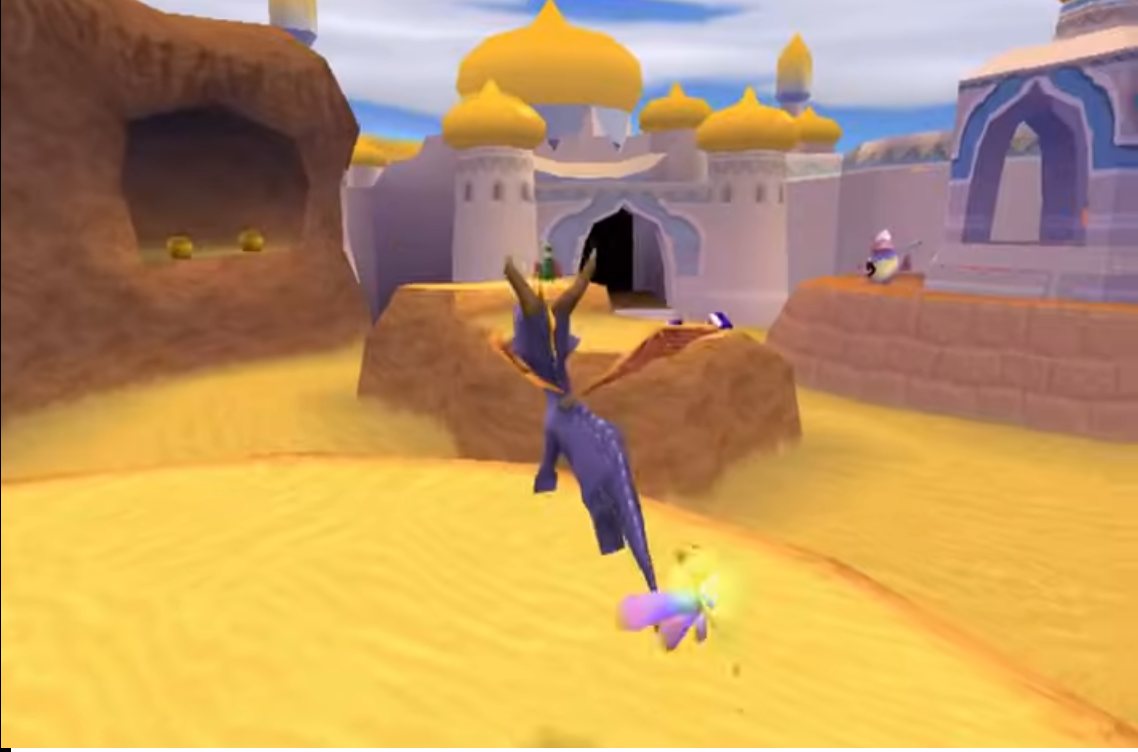
Desert/Arab inspired stage in Spyro 2: Ripto’s rage. The sand is all one very bright cartoony color. The Spires and walls of the far away building are purplish and yellow and very round. The game has a very good contrast of colors and bright colors. With whites being purplish and far away caves just using a single color rather than photorealistic colors
Immediately what stood out to me was the contrast. Most textures and objects had one or two single colors and they were all strong and vibrant colors. In Spyro I didn’t find many grays, or whites or blacks. The sky was bright blue. Walls were purple. Caves were a bright brown and didn’t look muddy at all! The desert sand was bright and clear, no hint of harsh browns or shadowy oranges. Going into another level, an ice level revealed this design philosophy to hold true even there.
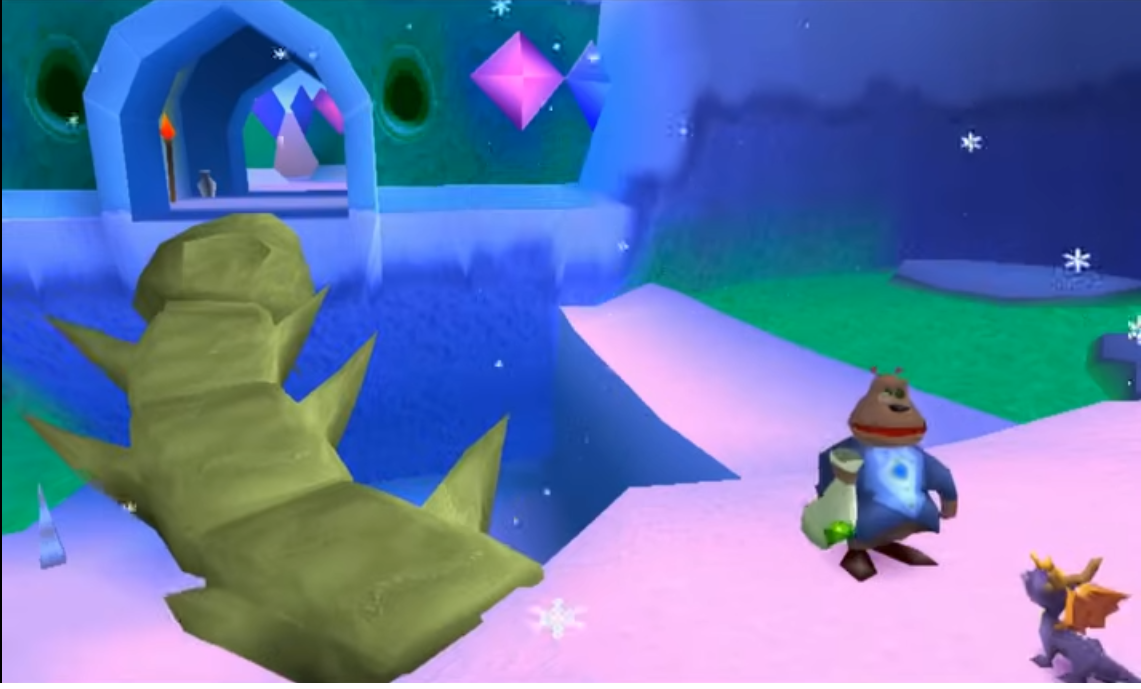
An ice level in Spyro 2: Ripto’s rage. Ice walls are a deep blue, the snow looks soft and has a pinkish tone and hue to it. Far-away ice has a green tint to it. A cartoony character (moneybag) stands near. A bone bridge has the bones be colored a pastel/yellowish tone rather than pure white and there is some pink in the background, contrasting the blue.
Even something as simple as snow avoided the dark shadows and deep, ugly colors. Snow felt inviting, ice walls had strong blue to them, and cold water was green. Not swamp, ugly, infested green but the kind of green that speaks of a pure spring. Spyro 2 showed me a lot about color theory and it was a game that I decided, I wanted to implement ideas from.
SLY RACOON
Continuing with the trend of games that have that cartoony and heavily stylised aesthetic I decided to take a look at another series that I have fond memories of. I believe the first Sly game I ever played was 2, at a cousin’s house but the first I ever owned for myself was 3. However it was the first game, a much more straightforward game still in the style of Crash Bandicoot that when I got the hd collection captivated me. To the point I sometimes speedrun it.
Something that always stood out to me with the Sly Cooper games is how readable their animations are. You always feel in control and like you are fast and nimble. The design of the characters is so strong that if you saw them only in a silhouette you would still recognise them. In fact you could black out the entire characters and you’d still know exactly what state they’re in and how they are animating. This is a clarity that my 3 or 4 frames of animation and limited Gameboy Color setup would not allow even if I wanted but it’s something that I greatly admire.
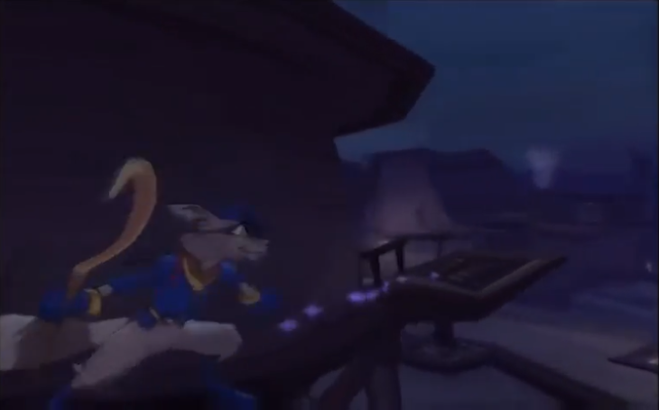
Sly Cooper slides and shimmies through a stylised, comic book like Paris. His movements are exxagerated and he looks extremely stretched as he shimmies. Despite the poor screenshot quality, he stands out beautifully from the background.
Another thing that I realised about Sly Cooper is that, even in the blues and swamp greens, and even at night the character is still immediately visible and recognisable to the player. The world is stylised, and there is plenty of sneaking through dark corners, avoiding lasers and well …you’re a thief so moments where you avoid the light but you can still see the character at all times at a glance. I attribute that to the strong use of outlines and slick lines though there is no doubt something about it in the level design and art design. Still, how readable on screen at all times Sly is despite the dark blue colors he wears and only hints of Yellow stands out to me and is something I want to emulate.
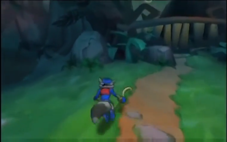
Sly stands with the back to the player. They’re in a washed out area of what is a swamp, green and brown around them however solid thick outlines make Sly pop from the world.
The characters are also stylised in a different manner than Spyro with longer legs and slimmer limbs and it’s something I tried to approach with my own art for the the character designs for the game. Still from Sly I want to take the readability and importance of character recognition at a glance.
Daffy Duck: Fowl Play
But looking at 3D games on the PS2 when we are making a Gameboy Color inspired game makes, perhaps, no sense and so we turn towards Nintendo’s handheld systems. There were a lot of games that I could pick from here. From the obscure japanese only games that I only know because they came in pirate multicarts to the well known IP and proprieties. The obvious one to look at would be Metal Gear Solid: Ghost Babel since that is by far the biggest influence and inspiration for the title. Perhaps sprinkling in some of the original Metal Gear as well?
And yet my mind was drawn a different direction. Although I could never claim to mirror Sunsoft’s amazing character animation and fluid sprite work I did remember playing a game by them on the Gameboy Color that was relatively short and had always amazed me with its background art. It wasn’t the incredible and detailed character animation I seeked to emulate, no, but the multilayered and yet simple backgrounds on this 2D puzzle platformer that I wished to take away from.
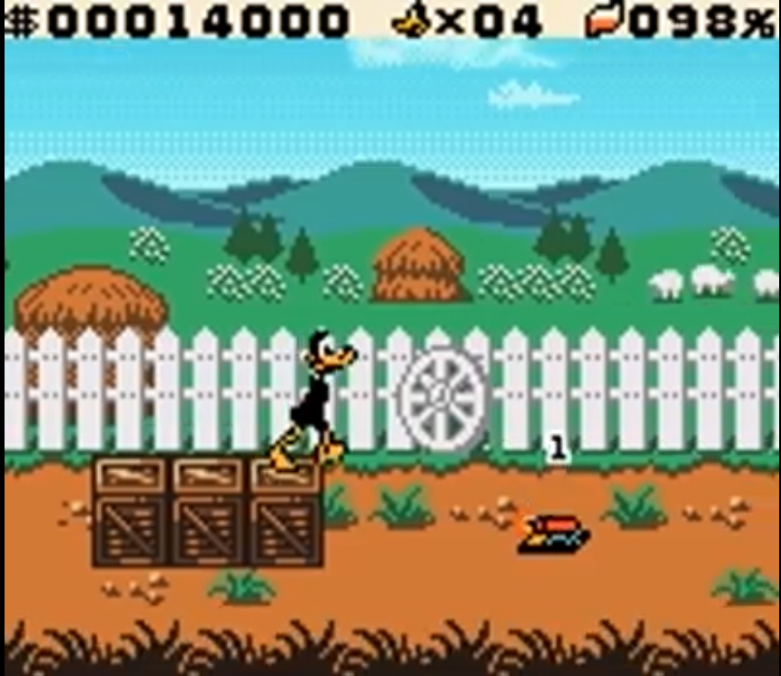
Daffy Duck Fowl Play on the Gameboy Color. Behind the character a fence, with some sprites that look like 3d objects of different sizes mirroring depth and even farther back a series of hills against the sky and trees slightly closer. The effect it gives is that there is depth and a vast field in the background despite the relatively simple shapes and repeated sprites.
If one were to look at the backgrounds they would see that, relatively speaking they’re a simple thing. Lots of repeated assets, and one or two sprites here and there. And yet the manner in which they are applied is so expertly crafted and done as to look fully 3 dimensional, as to suggest that the fields behind Daffy Duck stretch far beyond him.
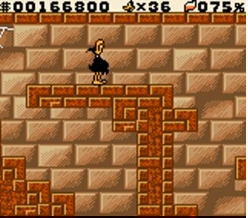
A screenshot from Daffy Duck: Fowl Play on the Gameboy Color. A simple repeating pattern of bricks is in the background and yet they are placed so that through different shading and coloring there appears to be depth to it with some “popping out”
Indeed even in the simpler backgrounds, literally just bricks or a repeating pattern one or two slight variations and off sets are enough to make it appear less like copy and paste and more like an intentional design. More impressively, the game works on the original Gameboy which means this works even without color! Having amazed me since I was a child what I took from Fowl Play was not the detailed animations or the simple but engaging gameplay. It wasn’t even its short length (you can beat it comfortably in 20 minutes). Rather, it was the detailed backgrounds.
Buzz Lightyear of Star Command (Gameboy Color)
From a game that I played in my childhood to a game that I have just recently obtained and have been attempting to speedrun we move on to Buzz Lightyear of Star Command on the Gameboy Color. Indeed I had played the 3D version on Dreamcast and it was one of the first games I acquired back on the Playstation and yet I had never looked at the 2D version on Gameboy Color
In many ways it’s not a great game. Movement feels loose and it’s entirely possible to trap yourself by not seeing what is ahead. The way they indicate jump is also hilariously quaint, just increasing the sprite size and making it look like a vertical bar, Buzz jumping with his arms glued to his body. It’s a simplified version that can also be beaten in half an hour and is missing half the content of the console version.
And yet as I dismissed looking at Metal Gear Solid: Code Babel it was the one game I choose to play with the perspective most similar to the work we’ve been doing. Being a Disney game it also featured bright colors and a design sensibility in many ways similar to what we intended to do with our affectionate parody.
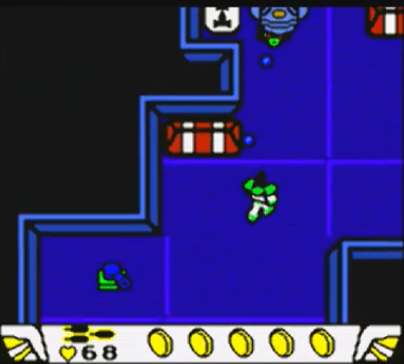
Screenshot from the Gameboy Color version of Buzz Lightyear of Star Command. The use of heavy lines and angles contrasted with black makes it appear as if the levels have vertical depth and are 3D.
What most stood out to me was the way it simulates or indicates 3D with just the use of black and harsh angled lines. Of course there isn’t real depth, not a Z dimension or anything, the game is all played in the same 2D plan and yet the simple trick of shading areas black and giving them strong outlines then making it impossible to walk over them or have Buzz not overlay them does a great job hiding it.
This strong “outline to simulate 3D shape” is present even without the black shading. There might be some perspective tricks at play here too, but even something as simple as fences and or pumpkins in the first level (agricultural in theming) look to be solid in a way that doesn’t fail to impress.
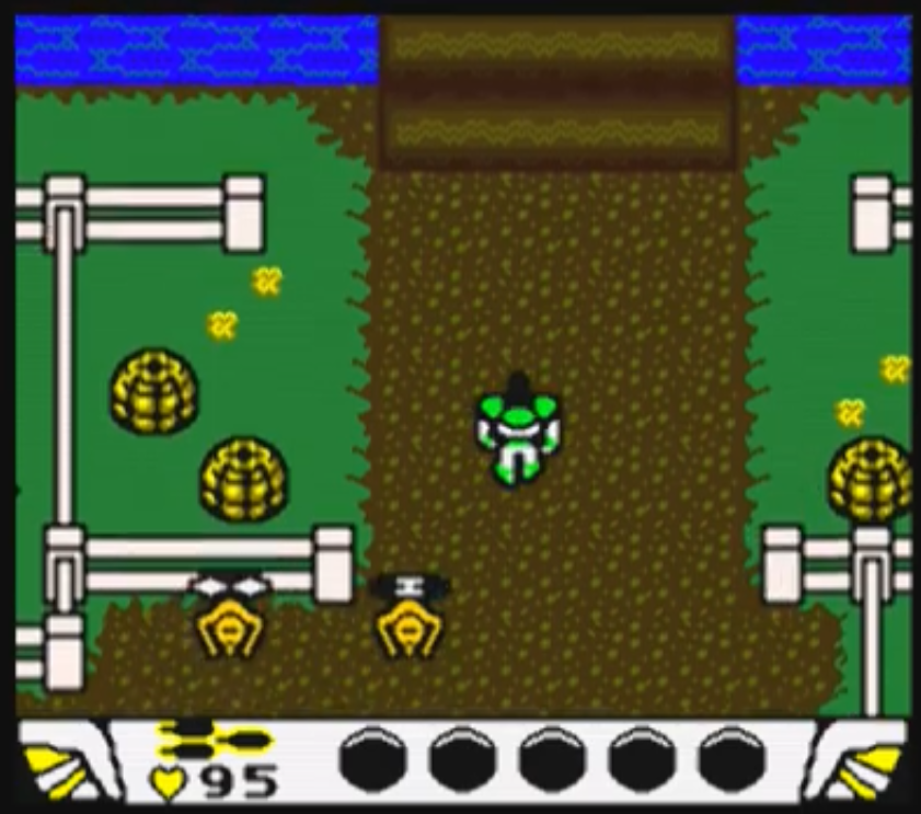
Screenshot of Buzz Lightyear of Star Commando n the Gameboy Color. Strong outlines make fences and pumpkins appear 3D. The camera seems to be at a slight tilt.
From Buzz Lightyear of Star Command on the Gameboy Color I wish to take the single but strong design to suggest depth.
ICE AGE (Gameboy Advance)
The last game I wanted to take a look at was Ice Age on the Gameboy Advance. It’s a pretty simple game that I once again speedrun (because shocker, I’m into that sort of thing) but the thing that most stands out to me about the game is not how it can be beaten in 20 minutes if you’re good at it (which I am) but how simple some of the animations are. Now without reiterating the plot of the entire Ice Age movie, a movie that holds up surprisingly well for plot reasons the mammoth you control in some of the levels has a human child at his back. I think it functions as just one sprite, not two separate ones, but that isn’t important to the argument.
What is important is that the child, not being a major focus has some of the simplest and most basic animation and design I’ve ever seen in a game. Two frame animations with basic moving pixels to the left and right by one or two pixels. In fact his body itself isn’t particularly detailed, being 2 color and two simple shapes. When the mammoth jumps the kid puts his hands up, and when the mammoth is floating on stench (yeah the game is weird) they simply draw a line of black pixels to indicate hair raising. They don’t even modify the sprite to make it so his original hair isn’t there. It’s wildly simple, effective and it showcases a conscious design decision to not be overly perfectionist or overly detailed.
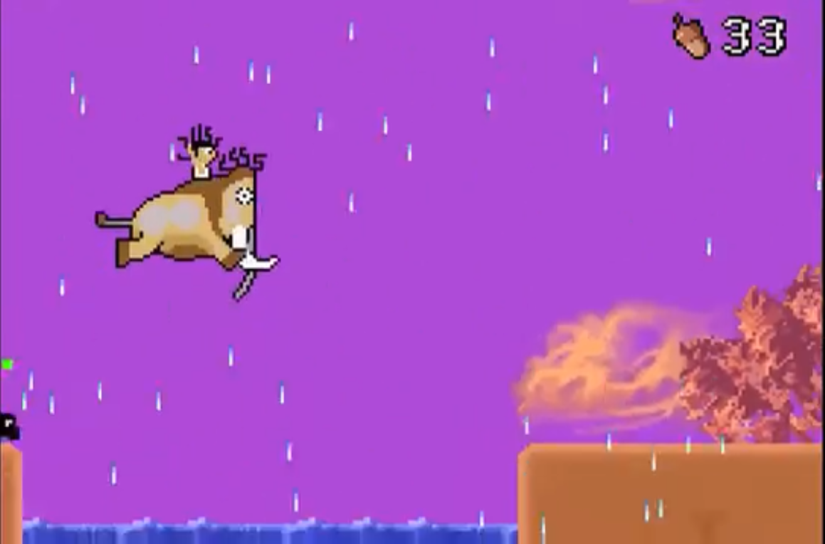
Screenshot of Ice age on the GBA. As they float due to bad smell both the mammoth and the kid have a series of pure black pixels drawn from their hair indicating that it was raised. They are also slightly colored a more pale color.
Same animation. Arms still raised up. Slightly colored paler to indicate that they’re nauseated but the biggest additions is a 20 second scribble of two or three lines of black pixels in a snakey pattern. It’s elegant how simple it is and yet it conveys the feeling.
In fact look at this screenshot:
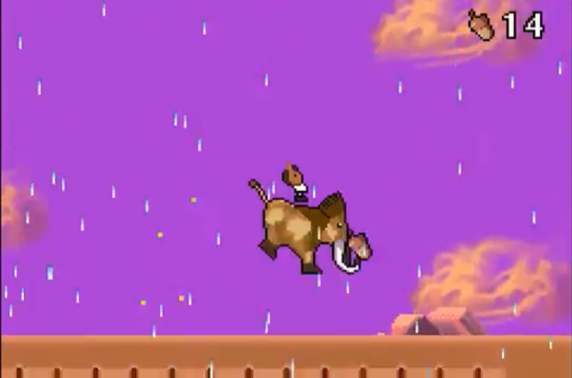
Ice Age on GameBoy Advance screenshot. The mammoth is falling and the kid on their back is a pixel or two above him. It’s possible to notice his body is just three simple shapes lightly colored, with no detail you’d expect from the GBA
The kid has no shading. His legs are a simple square of like 2 by 2 pixels. His feet just a rectangle. The entire sprite of the kid is done in simple shapes and paint bucket tool. That particular part of the mammoth sprite should not have taken more than 2 minutes to make.
It’s brilliant. Genius in how simple it is.
Now the kid isn’t the focal point of the sprite. But it had to be there. So why put in more effort than needed? Ice Age on the Gameboy Advance is a very simple game. But from it I want to take the clever shortcuts and reminder that sometimes perfect is the enemy of done.
And while I still have a few games I want to play (Jersey Devil on Playstation is on the list), I think I have developed a pretty good series of screenshots to show our artist when she’s back from ilness on what I want the environments to look like.
What I did this week:
So in conclusion this week on Stealthy Dicey I:
- Artificially inflated the number of games I’ve beaten or played in 2026
- Defined inspiration for the visual design that we are aiming for in the game
- Revisited my childhood and reinforced the idea that I want cute, not edgy
- Gained a new found appreciation for old games and reminded myself not all old games only have two frames of animation for movement
- Saw that sometimes two frames is all you need, given Ice Age.
That’s it for this week. Hopefully our environmental artist feels better and by next week I can have discussed the constraints and design we are looking for. But that is for next Sunday. For now I believe I’m done. Seeing you on the next Development Log.